Hand painted illustrations
Hilary is a professional author and illustrator of children’s books.


Oil Paintings
Hilary paints now in oils with a palette knife; various cityscapes and landscapes. She often works in a composite style incorporating a linear feel towards the subject with intense colour and patterning.
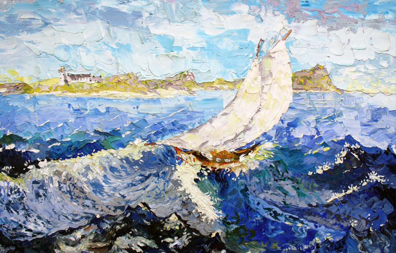
Sailing
Hilary Roper
Oil on Canvas
Her oil paintings are semi-impressionistic, vibrant, and still shows her skills for pattern and colour, even though the brushstrokes are broader and not as clearly defined with the linear patterning, that is easily recognised in her illustrative fine art.
She has covered subjects such as the River Wharfe, The Lake District, Barcelona, butterfly wings and moorland trees near to Haworth.
She follows her own mind and her own feelings and her concepts, albeit common enough are executed with an original vigour, and unique exuberance always displaying colour and pattern.
She is moved by weather patterns, landscapes and seascapes.
Hilary is available for commissioned works.
Teaching
She has taught both English and Art & Design in schools,colleges and prisons, including individual tuition of Phonics to children who suffer from Dyslexia.
Publications
Her first book, called Macfaddion’s Finest Hour, was published in 1990 and was recommended by Prince Charles for exhibition with the National Trust, Sudbury Hall, Derbyshire. The original Macfaddion set went on display there for over ten years; it has now been valued by Sotheby’s and has been recognised as a significant body of work. Macfaddion’s Finest Hour was also chosen by the Lancashire Librarian’s Children’s Association as their choice of entry for The Children’s Book of the Year Award in 1991. Surtsey the Cat will be published later in 2013.
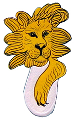
Macfaddion’s Finest Hour
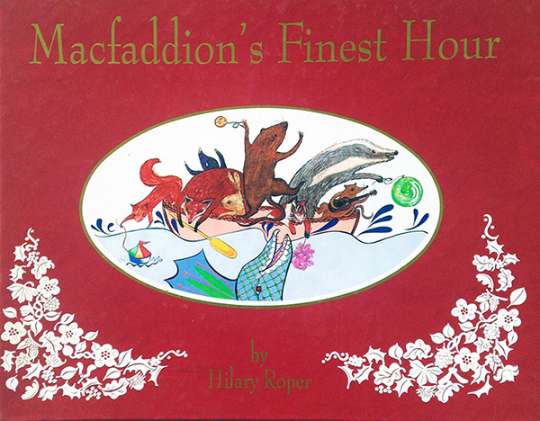
Macfaddion is a furry watervole who wants to help the community bring prosperity to the village at a time of recession, so he goes looking for a Dragon Bird to bring to the gala day. Watch this space for a second edition.
Macfaddion’s Finest Hour took ten years to create. Hilary studied and painted in the Harris Gallery, Preston, The Judge’s Lodgings Toy Museum, Lancaster, and the Manchester Science and Technology Museum. Because Macfaddion is a watervole and ferryman, she studied in the Barge Museum, Birkenhead and also painted in the Wild Fowl Trust at Burscough. The cottage interior was painted inside a traditional weavers’ cottage in Hutton in her home village. She will never forget the sheer delight of seeing a live watervole on the river Dove.
View more information on the Illustration and Books page
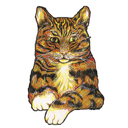
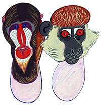
Surtsey the Cat
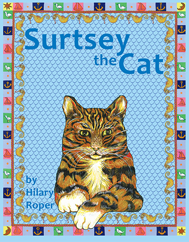
Surtsey the Cat is her second book now out on the market. It is about a gorgeous, stripy ginger cat called Surtsey who you just can’t help but fall in love with. But Surtsey breaks one rule; he gets himself into a very dangerous situation.
The story teaches children to care for others and more importantly not to break rules. Surtsey goes out to sea against the wishes of his master the fisherman and nearly drowns but for the help of a mermaid.
Surtsey the Cat is similar to a traditional fairytale yet with a contemporary feel. Each original illustration is hand painted; each illustrative page displaying a pretty border pattern following the traditional Russian fairytales. It has a phonetic patterning incorporated into parts and offers a wide vocabulary to little children who are learning to read, or when reading to children. This book is aimed for the two and a half to six year age range; an adult’s treasure book. The illustrative fine-art is stunning. Children will love it.
The castle on the front cover of her second children’s book Surtsey the Cat was painted in Kirkcudbright, by the harbour wall. Surtsey is a character, gentle, brave and fun. Of course the otters and mermaid and other fish are all from her imagination.
View more information on the Illustration and Books page
Personal
Hilary Roper was born in a small village called Hutton, near Preston in Lancashire and is married with two children.
She trained at Lancaster College of Art and Design, Leeds University and Edinburgh College of Art and Design.
Exhibitions
Hilary has held three major art exhibitions all reviewed by the national press, such as The Guardian. She has professionally illustrated for Royle Cards London and for Smith & Settle Publishers Otley.
She exhibited as a part of The Yorkshire Artists group show at Leeds Gallery in September 2012.
View the exhibition details here.
Exhibition Reviews
Hilary held a major art exhibition Hilary at the Vernon Art Gallery, Preston in 1973:
Hilary Roper exhibition in Preston, 1973
by Merete Bates
The Guardian, 1973
Hilary Roper’s work at the Vernon Gallery Preston, bears in flood such extremes that it’s almost impossible to draw any conclusions as to quality. Dismissal could be an instant reaction, especially to the soupy or simpering expressions in a series of Madonnas. And some of the earlier paintings have the over-ripe colour and cherub lines of crass corn. Even with regard to most of the work, there is something too easy, even cheapened about the sprawling, spontaneous shapes or lumps in the middle of space that make up many of the compositions.
Yet, set strongly against these severe limitations, there is an immediate and constant joy in colour that is rare. There is an ebullience, a proliferation of harmonies that seem as delicately instinctive as they are original. These flow into patterns of stripes, squares, whorls or sometimes the flattened shapes of common objects. Thus ‘Sunset on the Sea’ has a yellow stripe for horizon, fixed striped furls for breakers, and disintegrating cascades on the shore. The harmonies change with the subject. ‘Oil Slick and Birds’ is as fixedly patterned; but the colours are quiescently menacing.
This particular subject, however is rare because like a child, Hilary Roper is attracted to brightness. There is a magpie glitter about ‘Jewel Fly’ or ‘Shimmering Blue Butterflies.’ And the ‘King of Spades or the gold red and emerald of ‘Egyptian Pawn’ are stunningly rich. This would not matter were the richness were the richness of colour balanced by complexity of composition. Only very few, such as ‘The Smithy’ although too toy-like for a place full of sweat and smoke, begin to explore new variety of shapes such as anvils, ropes and stirrups.
The poetry alongside is often sharper, more explicit, than the paintings with a great feeling for wind, water and air:
‘Love is a goshawk wheeling in high limits,
Turning, tossing into freefalls, feeling.’
Only again it tends to overwhelm with emotion. And to compel with its vision as if no one else had eyes.’
And another exhibition in 1975:
Hilary Roper exhibition in Preston, 1975
by Merete Bates
The Guardian, 1975
At the root of Hilary Roper’s drawings and paintings lies an absolute rejection of the limited mundanities, monotonies and predictabilities latent in everyday life, together with a compulsive demand for heightened sensation and variety. It is as if, at all costs, she must find what she wants. Or if she does not find it, then she must create it. Only such an urgent passion could, somehow sustain an impression of unity, in spite of the extraordinary heterogeneity of style, represented in her exhibition at Salmesbury Hall, Preston.
In ‘Eygption Column’ smooth bars of pink, gold and turquoise mount in regular stepsup a central vertical. The effect is serene, reticent, balanced. In ‘Purneshvari’ a voluptuous Indian goddess rolls her breasts and belly, delicately looped with beads, with half smiling lips. Yet ‘Lavendar Iris Head’ is a sensitive representational study that would qualify for any botanical illustrative book. Gradually Hilary Roper’s visual abilities, as opposed to her ambitions or hopes emerge. Her abstract design is rhythmic, able to develop complexity within simplicity to shape a striking image. Her colour is intense and harmonious. She becomes weak only when she leaves imaginative for more traditional, observational work. Paintings of foxes, of an owl, of pheasant, sacrifice the the functional facts of form to superficial, decorative detail of fur or plumage. Obviously she may draw constantly on the shapes and colours of artistic or natural growth around her for inspiration – but she is best when she does not do this directly. It is hard to say how best she may develop but given that she does not wish to enter into direct commercial design (and this is not meant at all disparagingly) she might do better to concentrate on a single theme, if only in an attempt to realise that, in painting (more than literature) the subject is the language.